
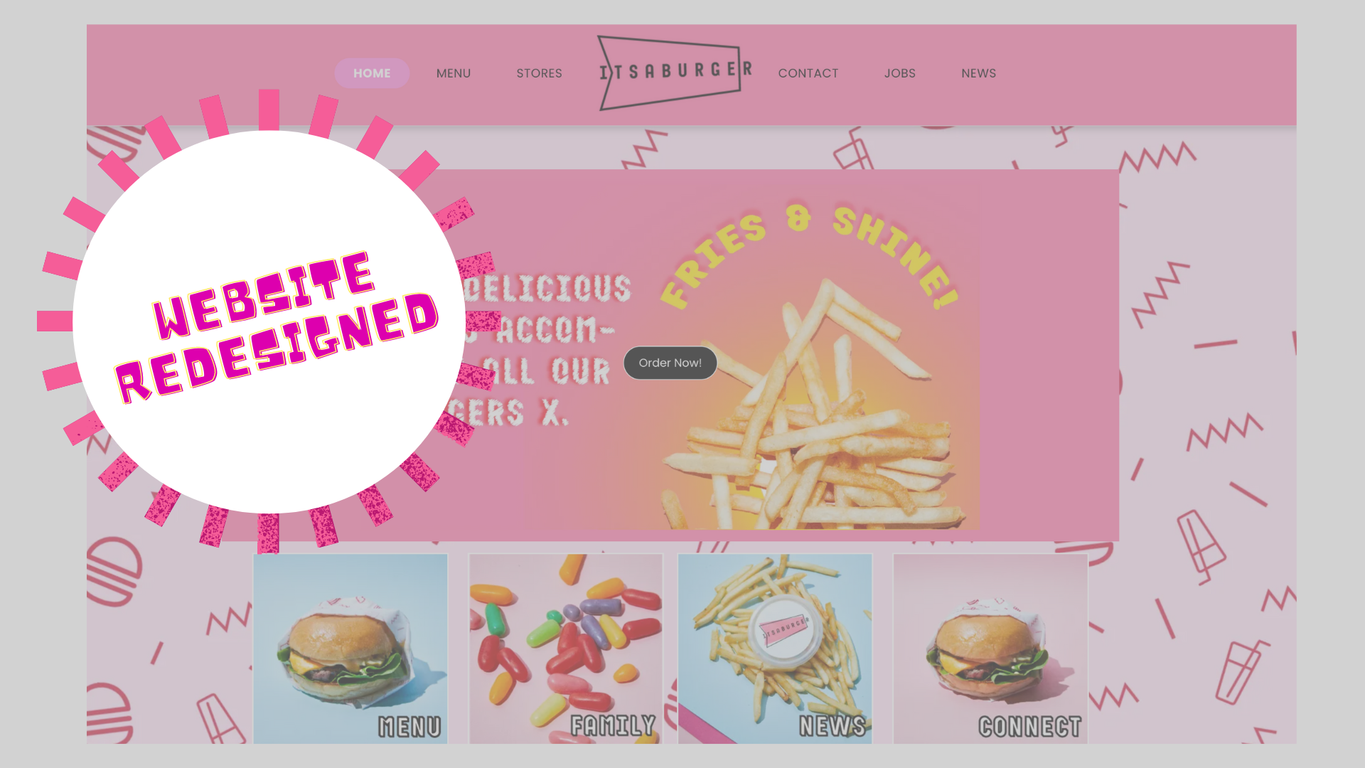
Website Redesign Case Study
Why A Website Needs A Strong Call To Action
Within a comparable 8 week period, the new website achieved some amazing results:
- 320% Increase in Click to Calls
- Double the amount of enquiries (form submissions)
- Quantifying Click to Maps (engagement tracking)
The primary goal of the website is to increase the engagement and conversion of a visit once the customer is on the website. This is crucial when you've already spent marketing money on getting the customer to visit your website, so you want them to click on a Call To Action button before they leave.
Call To Actions can be:
- Call Us
- Get a free quote
- submit an Enquiry Form
- Follow Us on Instagram
- Send us an email
A Website with a strong call to action will generate better conversion results once visitors browse the pages. If each lead is worth $100 to your business, then a 1% increase in conversion of 2,000 monthly visitors (from 1% to 2%) is worth $2,000 to you!
How The Business All Started
For two decades, Grady honed his skills in the hospitality industry before finally deciding it was time to step out on his own. In December 2018, with a rich background and a passion to deliver on Australia's burger culture, he launched ItsaBurger in Rosebud, Victoria.
Unlike their American counterparts, Australian burgers are known for their substantial size, explosive flavours, and top-notch quality ingredients - the 'two-handful' experience compared to the ‘one-handful’ burger in America.
Being conscious of the power of an online presence for the restaurant from the get-go, Grady made sure to set up a social media presence and a well-crafted website. He also created a proprietary burger ordering app, allowing ItsaBurger to hit the ground running with both in-store dining and online ordering from day one.
Opening A Restaurant During COVID
When Covid restrictions came into force, ItsaBurger was ready for this new normal with its proprietary App, which performed better than through Menulog and UberEats. The transition was seamless. Orders were coming through quickly, becoming the biggest revenue driver for the restaurant.
Despite being a restaurant in one of the world's most locked-down cities, ItsaBurger thrived, thanks to its seamless integration with a website and online presence.
Online Strategy and Growth
Over the past five years, Grady made two updates to his website. The first was the addition of Covid-related information, the second was the addition of a link to the ItsaBurger ordering app. By 2022, ItsaBurger's website had gained 18,400 visitors, marking an 87% surge within just 12 months. Interestingly, mobile users formed the lion's share of this traffic, accounting for 85% of all visitors.
Social media, particularly Instagram, also played a significant role in ItsaBurger's digital strategy. Now also with an in-house Social Media Manager, the focus is on boosting brand awareness and engagement.
The biggest challenge, according to Grady, has been the constant need to adapt to changing environments, customer preferences and delivery methods of the restaurant. From being an early adopter of online ordering, to months of lockdowns, Grady has navigated some of the most turbulent waters in the restaurant industry.
Website Redesign Project Results
As we look at ItsaBurger's journey, it's evident that a well-considered professional website design can be a game-changer. If you're an entrepreneur in the hospitality industry or indeed any industry, you might want to take a leaf out of Grady's book - leverage the power of a strong digital presence and be ready to pivot when necessary.
You'll be surprised at how far it can take your business!
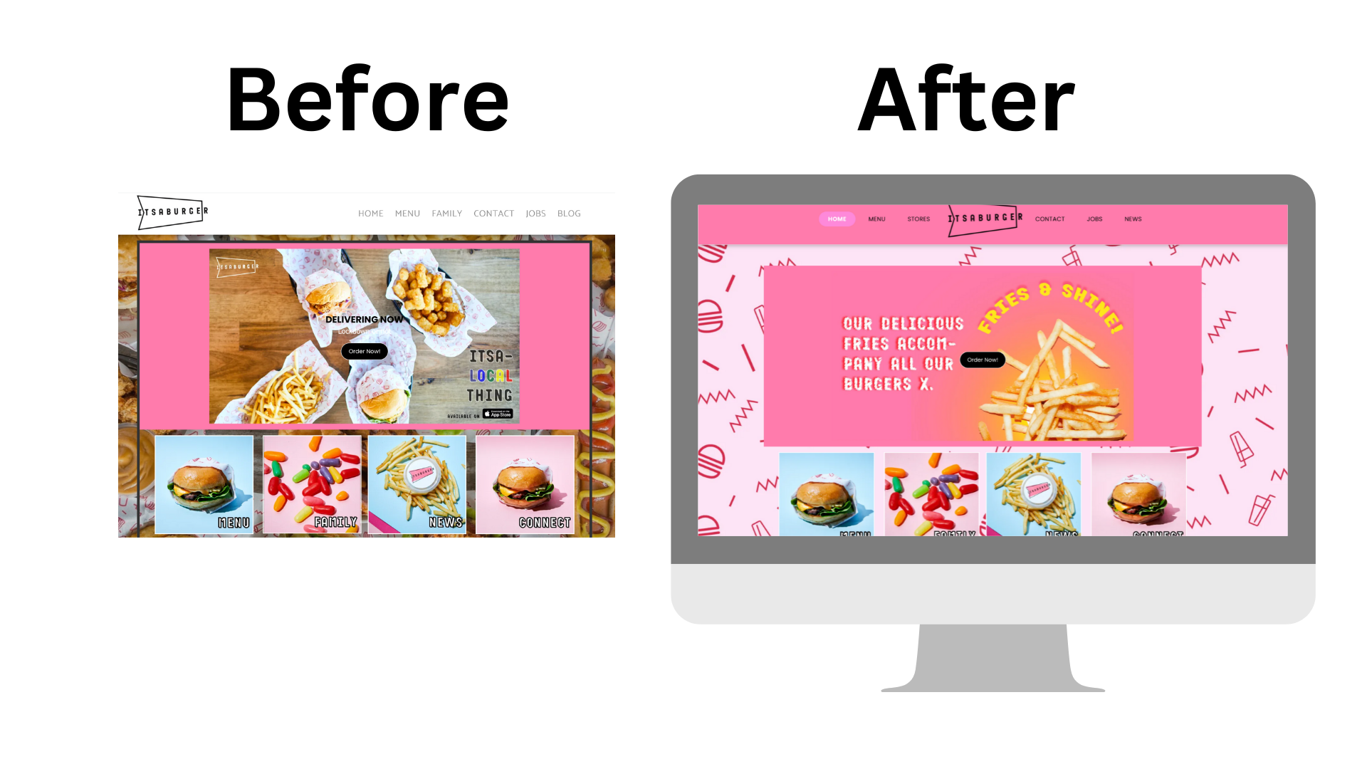
Branding On The Home Page
ItsaBurger already had a great website to start with, and the first thing that strikes our designers is the burger wrapping paper the restaurants use.
The distinct pink colour was a great way to make images pop and convey a fun and energetic brand personality.
On first glance, we can see that the most important button on the home page is the 'Order Now' button. This needs to pop more than the anything else on the page.
To achieve this, our designers switched out the photo background with the branding wrapping paper, so that the entire page is a consistent pink tone. Thereby ensuring that the black 'Order Now' button pops out from the background.
We also made sure everything is aligned to the middle, including the top navigation bar, to keep the visitor's eyes on the middle of the page.
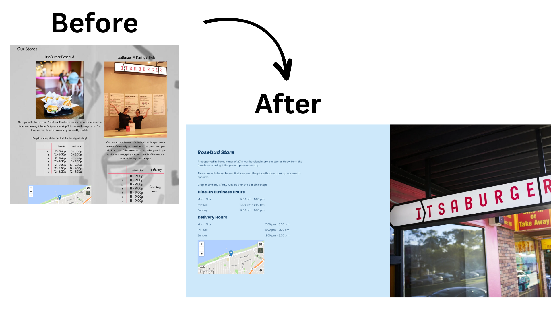
Displaying Store and Location Information
Like many businesses, the website is not the only presence it has, but physical locations and stores. For ItsaBurger, showing customers their store location and opening hours is important to retain existing customers.
Our designers changed the layout of the store page from vertical to horizontal, keeping the information consistent for each store.
The main goal we wanted to achieve on this page is to make it easier for Grady to display and make changes to the store opening hours. So, we transformed the image into a Opening Hours Widget, which allows you to customise and change your opening hours easily.
To keep the branding colours consistent, our designers also took the picture background away, and replaced it with a solid blue colour.
The website now tracks how many visitors click on the map and interact on this page.
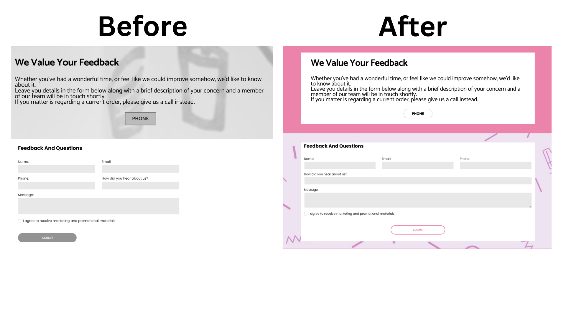
Clear Customer Feedback Form
As mentioned before, the crux of website design, is determining what is the most important element on the webpage. Here, getting visitors to leave a comment or provide feedback through the contact form is most important.
To achieve this, we made sure the text boxes pops out from the background. The two buttons 'Phone' and 'Submit' are now a consistent shape, and both aligned to the middle, so that the page is well balanced.
The brand colours are also key in making this page consistent with all the other pages, to keep the visitor engaged.
What next?
If you are interested in getting your website redesigned, feel free to reach out to our design team at design@championweb.com.au for an assessment on how we can help.